
I am so grateful I live in a world with color and that my eyesight allows me to distinguish between all the of shades and tones of each color. Color is an important part of quilting, especially at the beginning–selecting fabrics that “play together well” insures a winner. Color is a very broad far-reaching facet of all parts of our lives. Most of us have a favorite color that we select over and over or a color we never would wear. How important is color?
In the past few years in the United States, color identifies your political party allegiance. We are “red” states and “blue” states. (And some states call themselves “purple”, a mixture of red and blue.) Before the last presidential election, many women selected the color of their outfits to reflect their political beliefs.
We associate color with holidays.
Colors have been added to the traditional ones–Christmas prints have added light blues and grays. Purple is now a Halloween favorite. But most have remained the same.

Institutions identify with color. In Kansas, we know which university you or your children attend by your color choices– especially on game day.
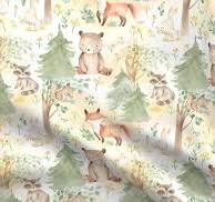
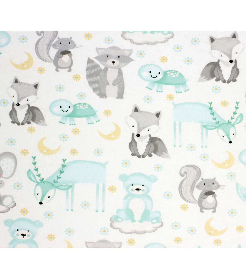
Color can be gender identifying; blue for baby boys and pink for baby girls. But according to the some sources, this practice only became popular in the late 1940’s. Before that, if you did not dress your baby in white—the more practical because it could be bleached, little boys wore pink, the stronger color and little girls wore blue, a color associated with the Virgin Mary. Colors for babies in the 21st Century include nature inspired greens, grays and muted colors.
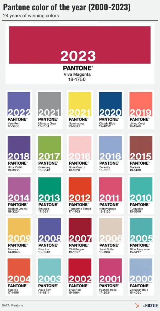
Colors come in and out of favor. According to Pantone–“a color matching system that standardizes and identifies colors of graphic design and printing”, 2025’s color is —-

See the variety of colors since the turn of the century. Pantone has 2,161 colors –so you have a several from which to choose.
Those of us of a “certain age” have colors that we associate with a particular decade in our lives. I still have an avocado and harvest gold crock pots! Then there were the homes with grey painted walls and grey counter tops and grey sofa in the 2000’s.
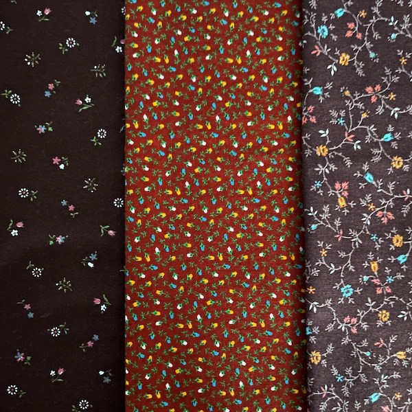
Color is one way we date quilt tops. Each decade had colors and print styles that were favored.
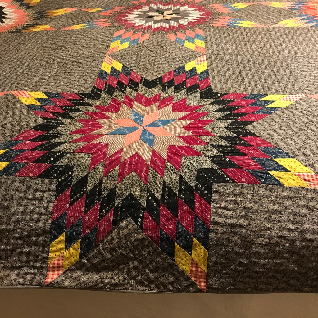
This Texas Star style quilt is made in the dark colors and small prints was favored in the late 1800’s and early 1900’s.
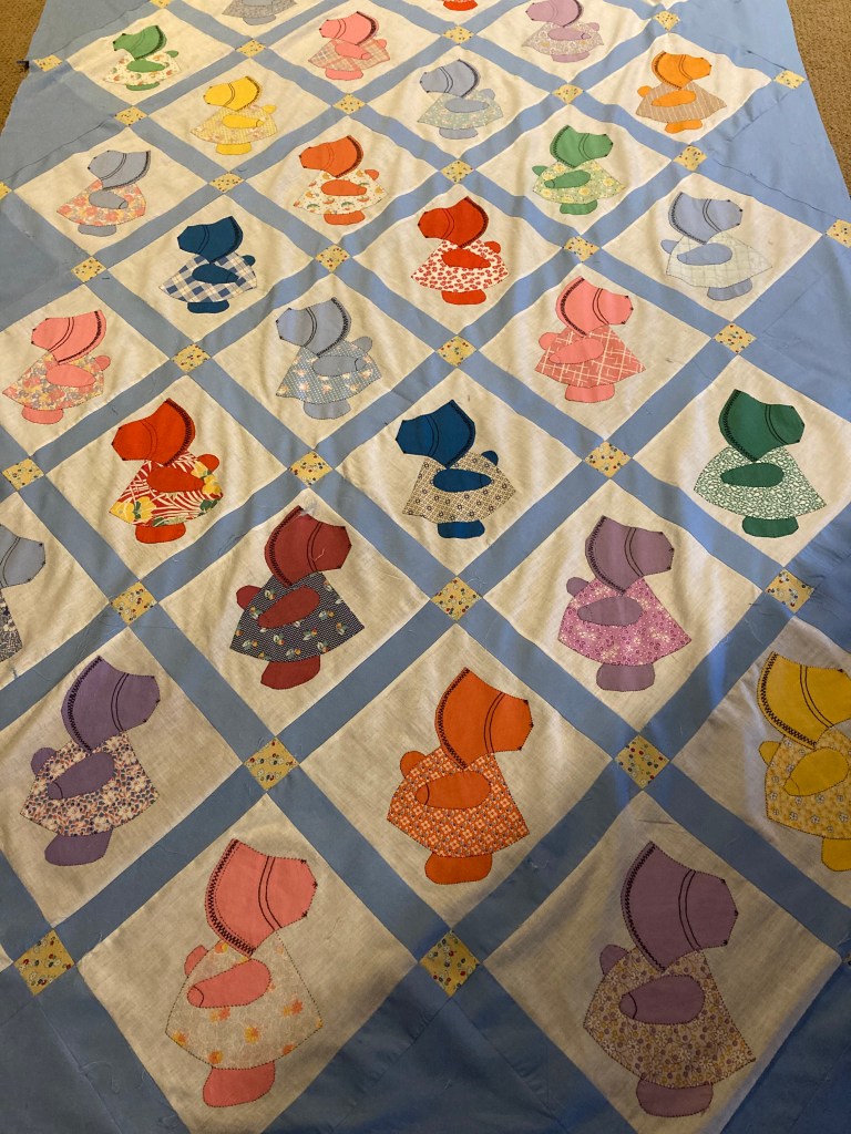
The 1920’s to the 1940’s are easy to identify–solid basic colors and tiny prints in all the colors were used. This was the period of the feed sack prints. Not many shades and tones were used in a design, just a stand alone color.
Who can forget the “flower power” and “hippie” influence of the 1960’s? And the popularity of polyester–that miracle fabric? Colors were bright–neon.
In the late 1990’s I made youth choir dresses for my daughter from prints that looked like they came from upholstered furniture in an home in England–very chintzy looking
Quilters used small prints found in the limited selections of quilting cotton in the 1990’s. Dusty mauve and blue were popular.
In 2025 we have soooooo many choices. Moda, on of the popular fabric manufacturers available in most quilt shops, has seventy five plus designers that contribute. Moda divided their fabric lines into six categories—classic, basic, metro, style, Ruby Star and Christmas. Moda has 1,884 different future prints! And Moda is just one manufacturer…
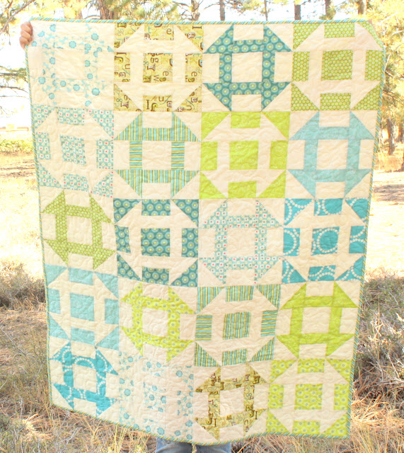
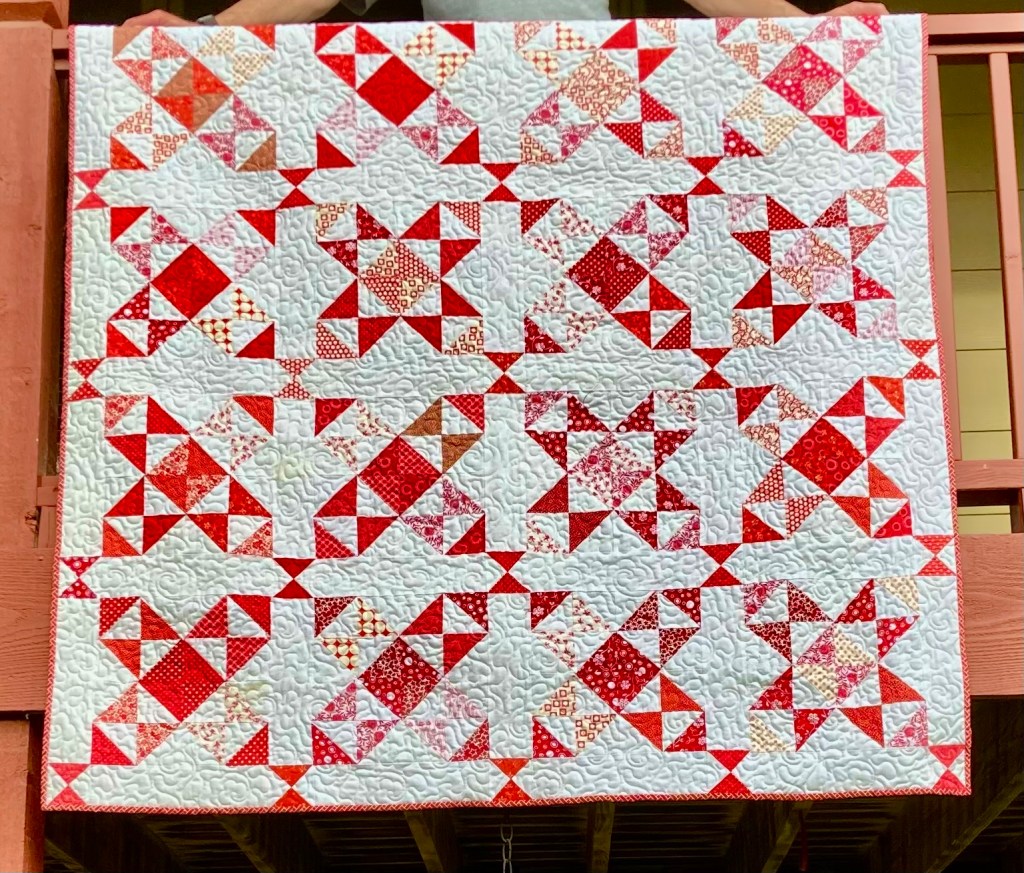
Quilt patterns or blocks have remained more constant. For example an old but favorite block is Churn Dash–the name tells you it is from another time. Here is two churn dash quilts but in different colors. The first is from the Civil War era and the second photo is a current photo. Colors make a difference.

Rules do exist concerning colors usage—but most quilters are guided by their intuition. Not to say that knowing about color basics–primary, secondary and tertiary; to recognize warm and cool colors and the color groupings–monochromatic, complementary etc doesn’t help.
But for those starting out here all a couple of rules I use.
1. The more shades and tones and prints of a color used, the less important it is that the colors match.

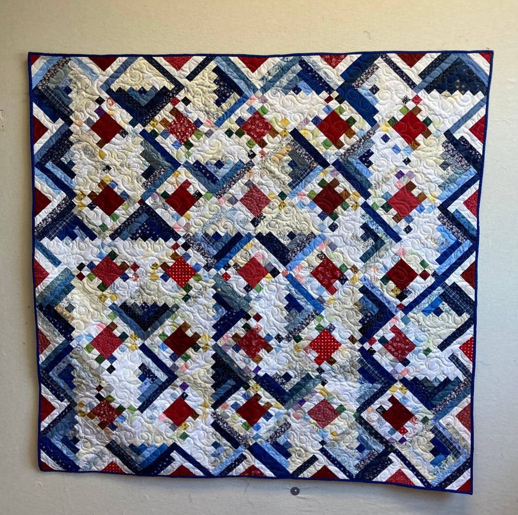
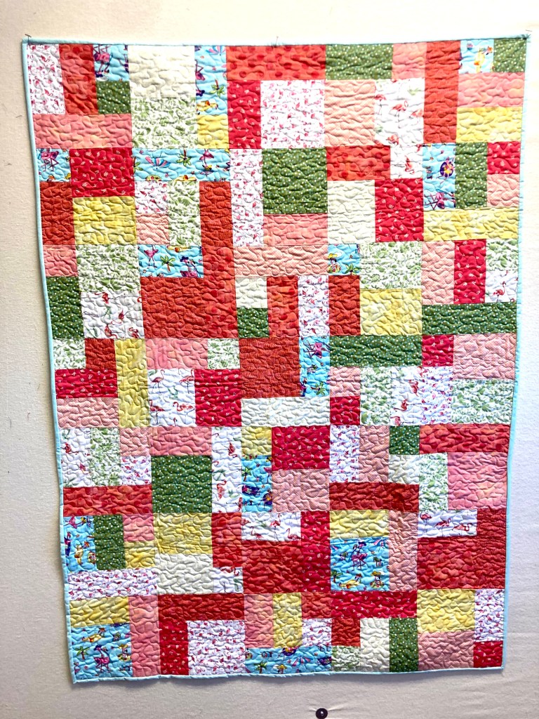
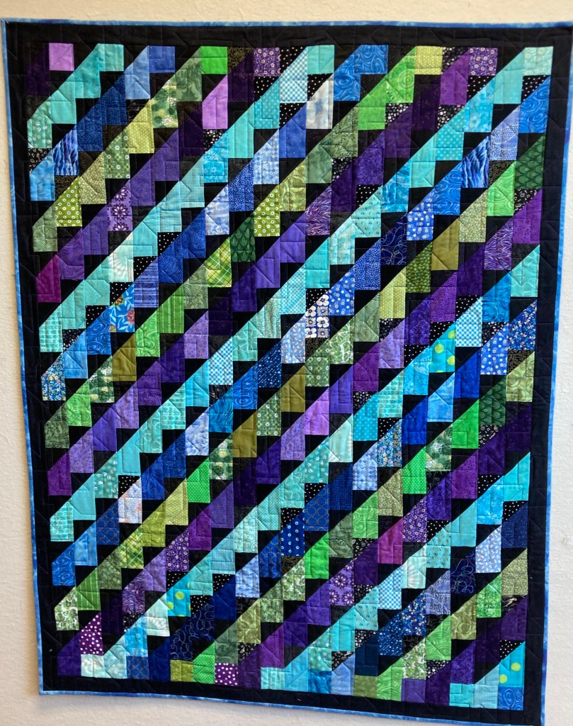
Elaine made this winner for the Quilters at First Sale. See all the blues and neutrals she used…bright clear blues, dark almost black blues, greenish blue and grey blue. They all play together well. This quilt is 68″ x 86″ and for sale for $225.
2. You can’t go wrong with a quilt of one color and a neutral background. They are classics.
3. A balance between lights, mediums and darks adds interest.
4. And one last color tidbit I often use is to add a bit of black–it is like seasoning in a dish–it enhances the other colors. Moderation is the key here.
Because Quilters at First is made up of 20+ women who have different color biases, there is variety of quilts in a wide range of colors. You can choose your favorite!
🎨🎨🎨🎨🎨🎨🎨🎨🎨🎨🎨🎨
We did have a few new items show up this week.


Spatter guards for your micro wave–$5 each
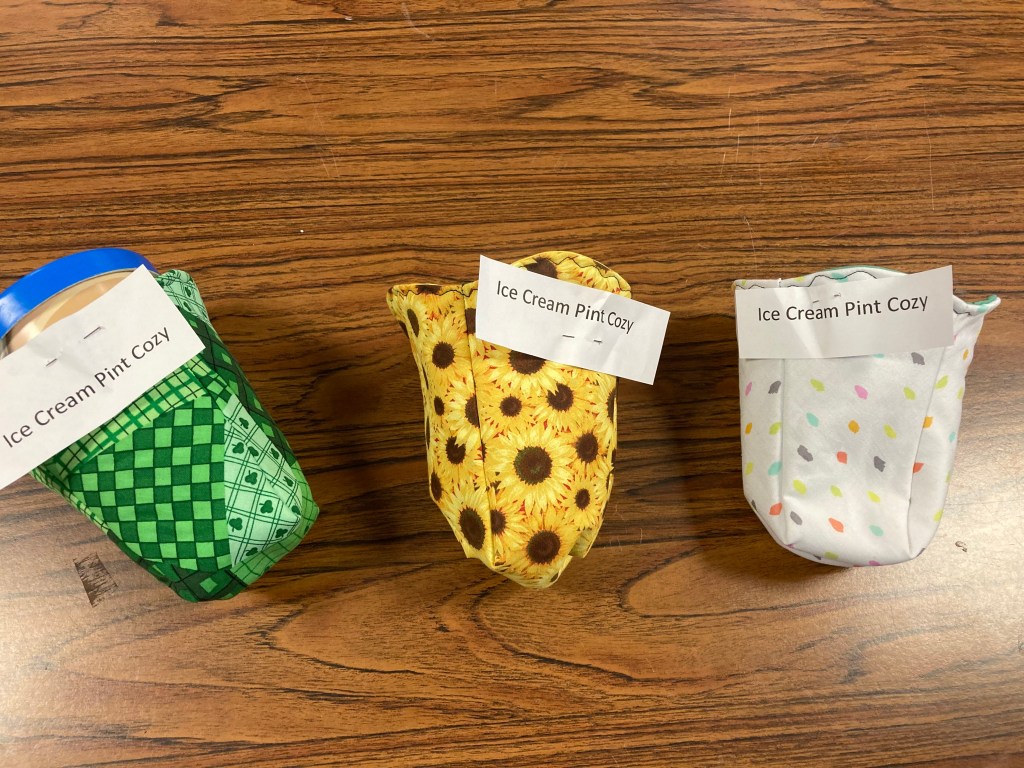
If you are prone to eat a pint of ice cream right out of the carton. Why not? $6 each
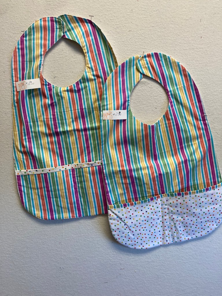
More adult bibs–help those tomatoes base sauces from permanently ruining your top. $15 each

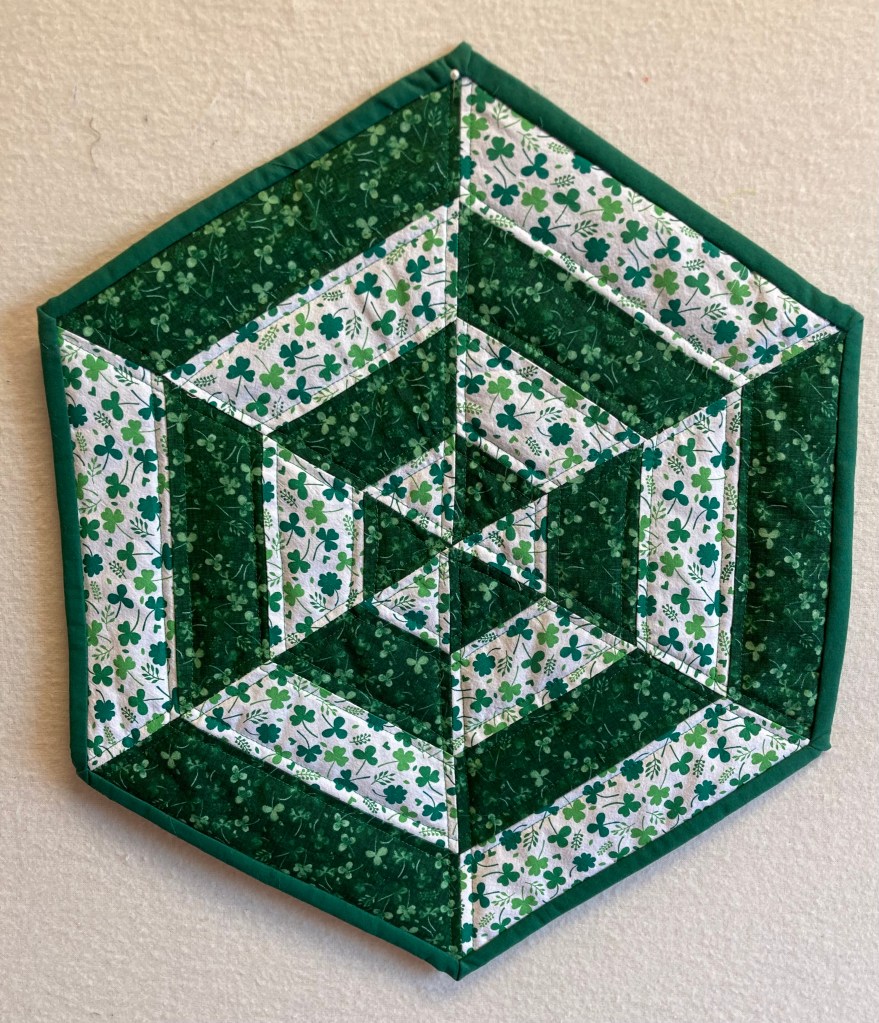
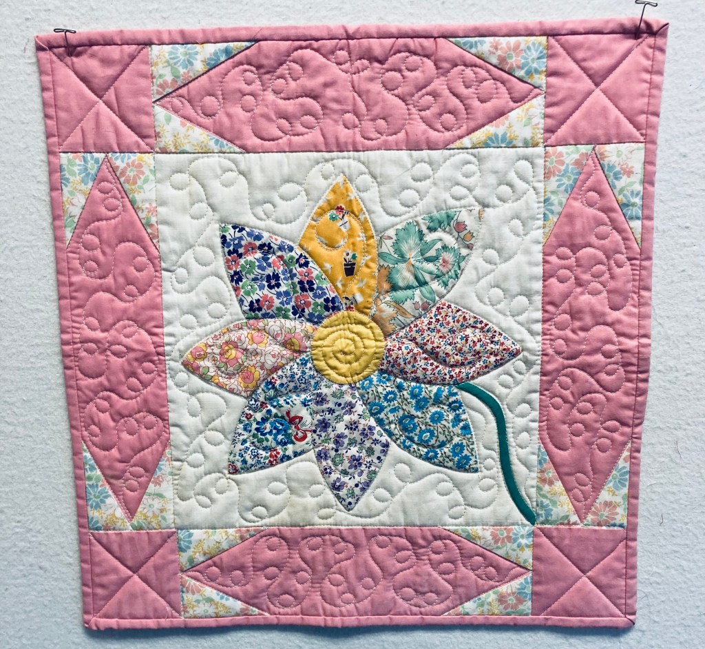
I promise you folks–there will be a spring someday! This 22″ x 22″ table topper will be perfect to set a pot of blooming bulbs on. $40.
The end of January in Kansas is rather monochromatic, so I hope you make your own world full of color this week.
